


DAVID ADAMS is impressed by ‘A Visual Theology Guide to the Bible’…
Tim Challies and Josh Byers (with Joey Schwartz)
A Visual Theology Guide to the Bible: Seeing and Knowing God’s Word
Zondervan, Grand Rapids, Michigan, US, 2019
ISBN-13: 978-0310577966
“One of the strengths of the book – and of infographics in general, is the ability to express what can be complex concepts in easy to understand ways. And that can be useful to someone who’s only recently opened a Bible for the first time or who has been on a long journey with Christ. It’s a fresh way of looking at some of the key concepts contained in the Bible.”
First up – a confession. I love a good infographic. I’m one of those people who when they come across a new Bible, immediately turns to see what supplemental information – maps, charts, graphs – have been included.
So when I spotted a new visual theology guide by US pastors Tim Challies and Josh Byers, I was filled with anticipation of beautifully coloured and innovatively constructed graphics that would present in visual form a series of insights into the Bible and its content. And I wasn’t disappointed.
A Visual Theology Guide, a sequel of sorts to their earlier joint effort – Visual Theology: Seeing and Understanding the Truth About God, is basically as advertised – divided into three parts looking at how the Bible was constructed and why it can be trusted, how to approach study of the Bible, and, the content itself, it uses often quite simple graphics to bring to life the points being made (although it’s fair to say there is still a considerable amount of text within its pages).
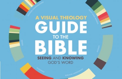
In the first chapter, for example, we encounter a chart explaining the different genres of the Biblical books, in another there’s a breakdown of the Bible not only by genre but also by language, audience and author (among other things). In chapter five, there’s a 21 point chart explaining why we can have faith in the accuracy of the transmittal of the Old Testament through the centuries, another in chapter seven showing the complementary application of the text by hearts, heads and hands. And in chapter 11, there’s a map of Israel’s (incomplete) conquest of the Promised Land and in chapter 14, a detailed graphic showing the lineage of Jesus in the Gospels of Matthew and Luke.
One of the strengths of the book – and of infographics in general, is the ability to express what can be complex concepts in easy to understand ways. And that can be useful to someone who’s only recently opened a Bible for the first time or who has been on a long journey with Christ. It’s a fresh way of looking at some of the key concepts contained in the Bible.
Designed for a visual generation, this is a useful tool for prying open the Word. One can only hope the collaboration continues.