


EMILY MCFARLAN MILLER, of Religion News Service, reports on the current trend for – and long history of – “premium” Bibles…
At first, social media users weren’t sure if it was an elaborate April Fool’s joke. It was, after all, 1st April when the billboard appeared above New York City’s Canal Street advertising a Bible with a $US300 price tag.
The limited edition, art-inspired GPC NIV Bible is described on its website as a “modern version of God’s Holy Word” and an “ambitious project, elevating the aesthetic to God’s Holy Word with artisan qualities”. Those qualities include gold foiling on its “striking crimson red Soft Touch cover” and sustainably sourced paper. The title of each book was lettered by New York City artist Eric Haze.
“Rooted in humility with an ambitious mission, we set out to build a fresh, relevant brand around the best selling book in history – the Holy Bible,” says the Good Publishing Co. website.
Relevant Magazine called it “Hypebeast-inspired content.”
Commenters on Instagram asked if the Bibles had been autographed by God and quoted Jesus’ own admonition: “Do not make my Father’s house a house of trade.”
Instagram posts by the Good Publishing Co highlight their new limited edition, art-inspired NIV Bible. PICTURE: Screengrab
So-called “premium” Bibles aren’t new.
And while they may not carry the same steep price tag, a number of new and traditional Bible publishers are stressing the beauty of an old-fashioned book and the experience of slowing down to read at a time when so much of life is lived online.
“There’s a long tradition of Bibles being published, even hundreds of years ago, that were trying to use the finest materials to honour the legacy of the text,” said Tim Wildsmith, the pastor and blogger behind the Bible Review Blog.

Bibliotheca is a five-volume version of the Bible created by Adam Lewis Greene. PICTURE: Courtesy of Bibliotheca.
“It’s geared toward an enjoyable reading experience.”
– Book designer Adam Lewis Greene.
Wildsmith, who reviews all kinds of Bibles on his blog, said he hasn’t seen a copy of the GPC NIV Bible in person to know if it’s worth several hundred dollars, but it’s not that much more expensive than some other premium Bibles. The most expensive by publishers like Schuyler or RL Allan are around $US200 to $US250, he said.
“I think that having a beautiful version of the Word of God is actually a way to honour the sacredness of the text and the high value we place on it in our lives,” Wildsmith said.
Plus, he said, millennials – the generation that popularised Instagram – care about the way things look and feel.
In the last decade, independent projects like Bibliotheca have brought that same reverence and an eye for design to Bibles at a more modest price tag – and shown big Bible publishers there’s a market for it.
Bibliotheca’s Kickstarter, launched in 2014 by book designer Adam Lewis Greene, envisioned a “design-conscious alternative” to traditional Bibles, according to its website. That meant splitting the Bible from one giant tome into four volumes (plus the Apocrypha), each with proportions based on the measurements for the Ark of the Covenant. Inside, a typeface designed exclusively for the project presents the sacred text without chapter and verse numbers, subheadings and other notes that usually appear in Bibles.
“It’s geared toward an enjoyable reading experience,” Greene said in the video introducing the Kickstarter.
The project became Kickstarter’s most-funded first-edition book project to date, far exceeding the crowd-funding goal the designer had set.
Traditional Bible publishers took note.
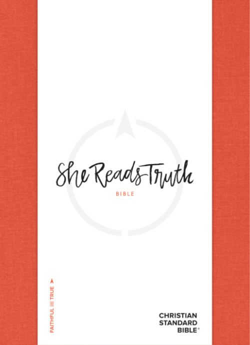
“She Reads Truth Bible”. PICTURE: Courtesy of Holman Bible Publishers
“Simply put, beauty in our work matters to us because we believe it honours God, the beautiful one and source of beauty.”
– Amanda Bible Williams, co-founder of She Reads Truth.
In 2017, Zondervan published the NIV Sola Scriptura Bible Project, which, like Bibliotheca, breaks the Bible into four volumes without chapter and verse numbers or other notes.
That same year, Holman Bible Publishers partnered with Bible study community She Reads Truth to publish the She Reads Truth Bible, described on its website as “inherently beautiful” and “intentionally designed.”
The She Reads Truth Bible includes reading plans, devotions and maps and charts for each book of the Bible similar to those shared on the She Reads Truth app, website and study books. It also is available with several different covers, including a bright poppy linen, and features hand-lettered key verses at the introduction of each book and typefaces designed for readability.
“At She Reads Truth, we believe in pairing the inherently beautiful Word of God with the aesthetic beauty it deserves. Each of our resources is thoughtfully and artfully designed to highlight the beauty, goodness, and truth of Scripture,” Amanda Bible Williams, co-founder of She Reads Truth, said in an email to Religion News Service.
“Simply put, beauty in our work matters to us because we believe it honours God, the beautiful one and source of beauty.”
Another recent project is Alabaster’s The Bible Beautiful, which is reimagining each book of the Bible as a single volume, printed on thick paper with original photography and attention to typography and negative space. So far, it has released 16 books.
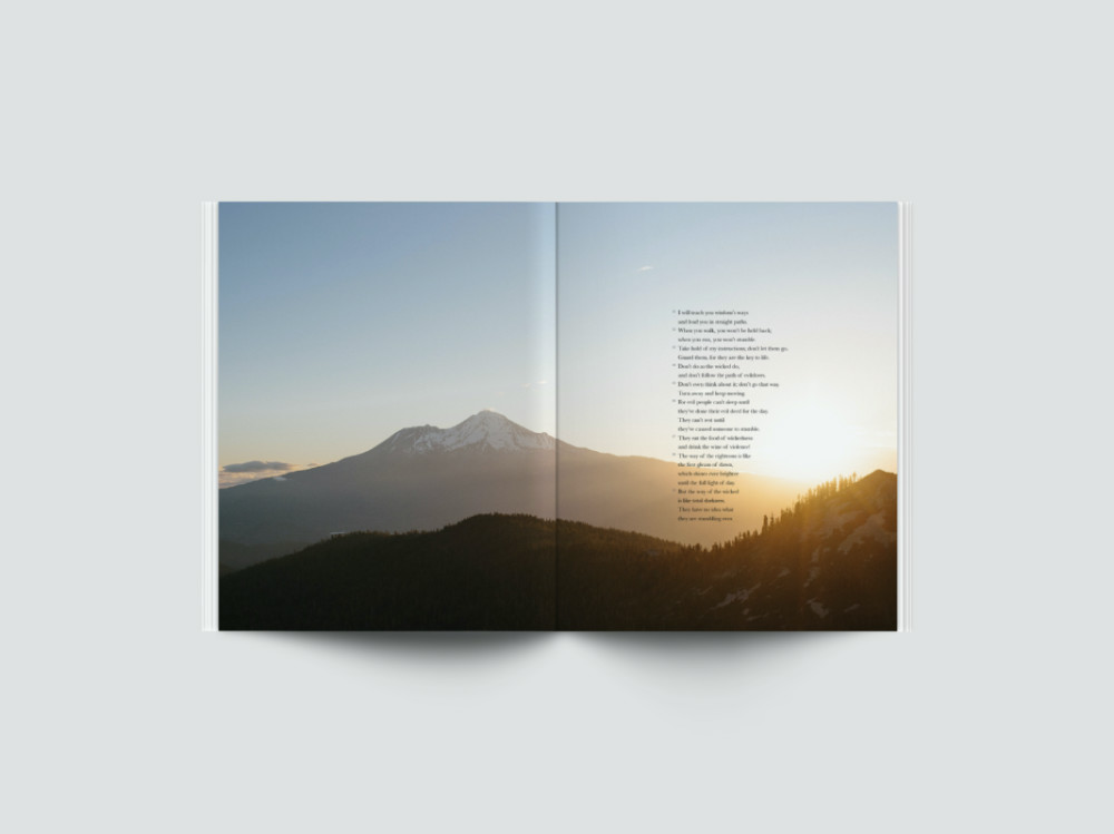
A two-page spread in Proverbs. PICTURE: Courtesy of Alabaster Co.
For Alabaster co-founder Brian Chung, it was a matter of making the text accessible.
When Chung became a Christian in college, he said he was excited and also intimidated by his first Bible. It was leather-bound with extremely thin pages. Some of the words were printed in black. Others were red.
“I was just not like any book that I had experienced,” he said.
Sitting next to it on his desk was his marketing textbook, designed to look like a magazine. It was the first time he said he felt excited to read a textbook — and it gave him the idea that eventually became Alabaster, co-founded with Bryan Ye-Chung.
“I think as someone that was studying both business and design, I just thought, ‘Could the Bible be done differently?’” Chung said.